Over the past month, news headlines worldwide have been dominated by a single topic, COVID-19. COVID-19 (colloquially called “the Coronavirus”) originated in mainland China where it infected tens of thousands over the course of several weeks. Since then, news coverage of the virus’ progress has been constant. People around the world have been subjected to a media barrage of news about the potential dangers of a plague and about each new country COVID-19 has spread to. This has led many citizens of all countries to fear that there really is a pandemic brewing in their own backyards. Others have dismissed the news as overblown and exaggerated.
This begs the question: How far is the Coronavirus actually spreading? In layman’s terms, is it time to panic?
Geographic Distribution
To answer this question, I used the 2019 Novel Coronavirus COVID-19 (2019-nCoV) Data Repository operated by the Johns Hopkins University Center for Systems Science and Engineering. The data sets contain the number of confirmed cases, recoveries, and deaths from COVID-19 for countries and towns around the world.
Using this data I was able to create a geo-scatter plot to visualize the current geographic spread of COVID-19.
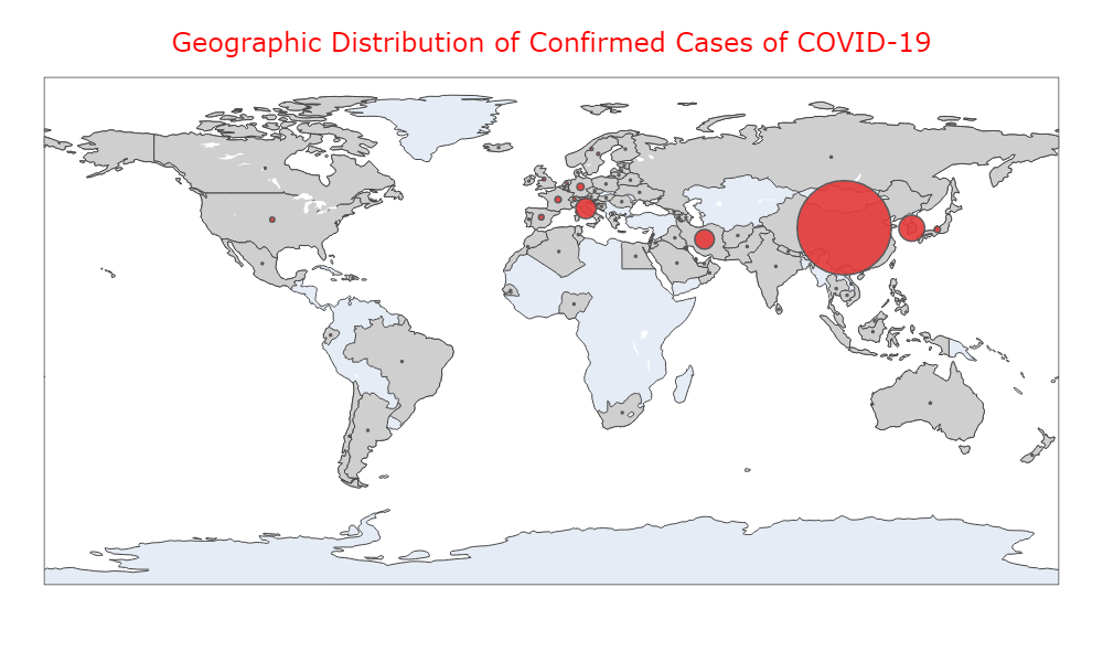
The area for each bubble represents the total number of confirmed cases for a country. Any country with at least 1 case has been filled with grey. Countries without any confirmed cases are pale blue.
As we can see, a large number of countries around the world have at least 1 confirmed case. However, the vast majority of cases are still confined to mainland China. There are some notable bubbles in South Korea, Italy, and Iran. But most other countries have cases that number in the low hundreds or lower. To give you an idea of the numbers we’re looking at, here are the top 5 regions with the highest number of confirmed cases.
| Rank | Region | Confirmed Cases |
|---|---|---|
| 1 | Mainland China | 80,271 |
| 2 | South Korea | 5,621 |
| 3 | Italy | 3,089 |
| 4 | Iran | 2,922 |
| 5 | Others* | 706 |
From the above table, we can see that China dwarfs everyone else as far as number of cases. We can also see a steep drop off as we go down the list. The U.S. is number 10 with only 153 cases as of this post. And relative to a population of over 300 million, this number is incredibly small. So, while the virus may pose an imminent threat, the average American is quite unlikely to wake up tomorrow and find him or herself diagnosed with COVID-19. So readers may rest assured that they don’t need to panic yet. However, the above data is merely a snapshot in time and doesn’t tell us much about the past or future. So what does the virus’ progress look like over time?
Virus Spread Over Time
In order to answer that question, I plotted the cumulative total of confirmed cases, recoveries, and deaths both within mainland China and outside of China.
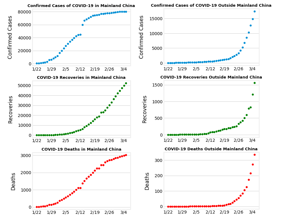
This result may seem startling. While it looks like China will be fine going forward, the rest of the world is experiencing a rapid increase in the number of cases.
But this interpretation ignores 2 important things. One, it doesn’t look at the story the graphs for mainland China portray. Two, it ignores the axis values.
The graphs for mainland China show that the virus’ spread began to level off around 80,000 cases. The number of deaths followed a similar trend. While the number of recoveries is still increasing. The reason why the number of cases leveled off can’t be 100% determined, but I suspect it’s due to China’s quarantine efforts. If this is true, and the world also follows quarantine efforts, then we should expect that the worldwide graphs will mirror China’s graphs. The only difference would be a time delay since the virus has only just recently spread abroad. But right now, the worldwide graphs don’t resemble the china graphs whatsoever. So what gives?
Looking at the axis values, it’s important to note that the total number of confirmed cases is quite small relative to the total number of cases and the worldwide population. So the curve may look steep, but that’s largely due to the fact that going from 10 to 100 cases represents a large increase. But on a population scale of tens of thousands or higher, those numbers are tiny. In order to counteract this effect, let’s redo the graph but change the scale to the total number of cases.
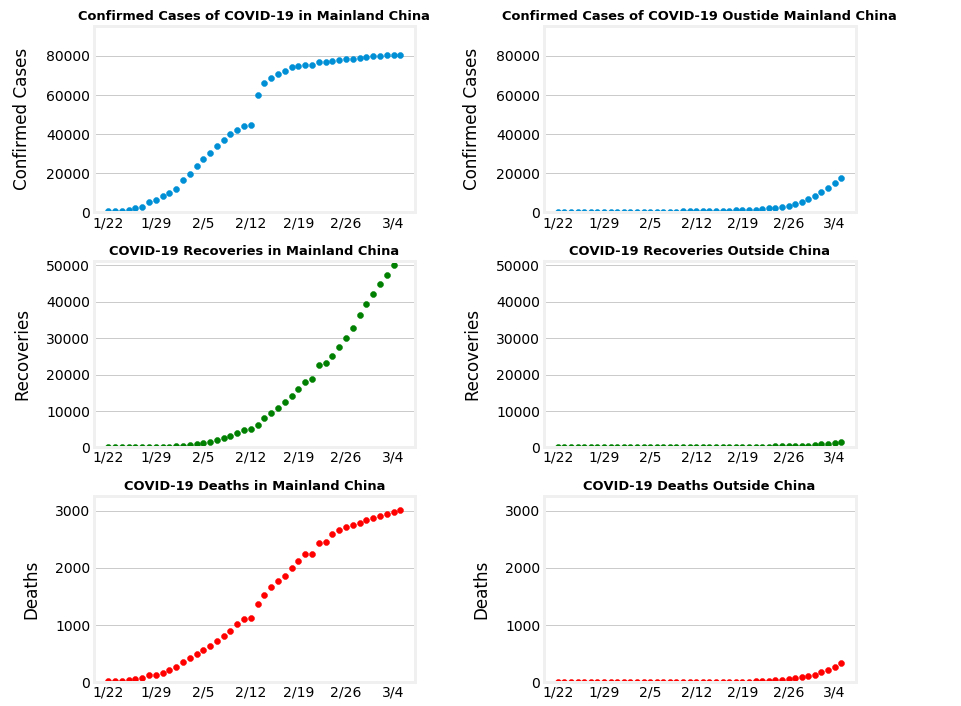
As we can see, the graph for cases outside China looks much less extreme. In fact, it looks like the beginning of the graph for China’s cases. This is consistent with our statement earlier about the world graph mirroring China’s with a time delay. So to answer our question of how far the virus will actually spread, our graphs suggest that it will continue to spread for some time. But if we take proper safety measures it will eventually level off.
There’s one last common concern I’ve left relatively untouched so far: “Will I die if I contract COVID-19?”. To answer this question, I plotted worldwide recoveries and deaths on the same plot.
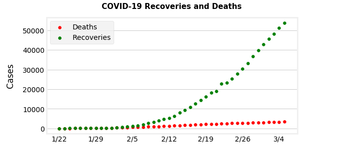
From here, it should be easy to see that you are far more likely to recover than to die if you were to contract the virus. This is consistent with the 3% fatality rate that has been reported so far. Another factor to consider is the fact that many infected individuals experience mild symptoms or are asymptomatic. These individuals are less likely to be tested and don’t experience severe enough symptoms to die from the disease. Thus, it’s likely that the true fatality rate is even lower than the one calculated from current data. In short, our data suggests that there’s no need for the average American to worry about dying from COVID-19.
Other Factors
The above analysis and discussion is based only on the data sets provided. There are many factors that were not taken into consideration. These factors include:
-
Reliance on testing kits and labs: Our confirmation data depends on the availability and usage of testing kits and labs.
-
Long incubation period: The available data covers only about 6 weeks. The incubation period of COVID-19 ranges from 1 day to 2 weeks. So there could be a large number of cases that haven’t been detected yet.
-
Mild or asymptomatic disease: Most individuals won’t experience severe symptoms. This means that they are less likely to be tested which could mean there’s a large number of cases that went unnoticed and unconfirmed. The flip side of this (as discussed previously) is that the fatality rate would be even lower than current calculations suggest.
-
Demographics: Some demographics may be more prone to contracting the disease and/or dying from it than others. This would be useful information to further specify who should worry about the virus.
The above list is by no means an exhaustive list. But as you can see, there are so many considerations that it’s hard to make any definitive conclusions at this time. So while the conclusions made in this post may be supported by the evidence provided, they should not be taken as fact or certainty.